Do you know which social media platform brands use the most?
Twitter. 79% of a business’ social posts will occur on Twitter.
But guess where the majority of your shares come from?
Facebook. Statistically, 29% of your shares will come from Facebook (as opposed to 13% on Twitter).
It’s literally a numbers game. With 1.59 billion people on Facebook (vs 320 million on Twitter), your reach is just flat-out bigger. Your Facebook posts will reach more people.
That’s why you need to nail your call to action on Facebook.
But let’s flip this on its head. The traditional call to action (or CTA) that we know is dying.
If you’re still thinking a call to action is a button that says “Learn More”, keep reading. Because that’s just one part of the overall equation now.
See, call to action is not just the end action Facebookers take. The call to action on Facebook starts far before that.
When they stop scrolling? That’s an action.
When they read your post? That’s an action.
When they click? That’s an action.
Looking out the window?
Which is also technically an action.
So it’s about time for a more holistic approach to what a call to action really is on Facebook.
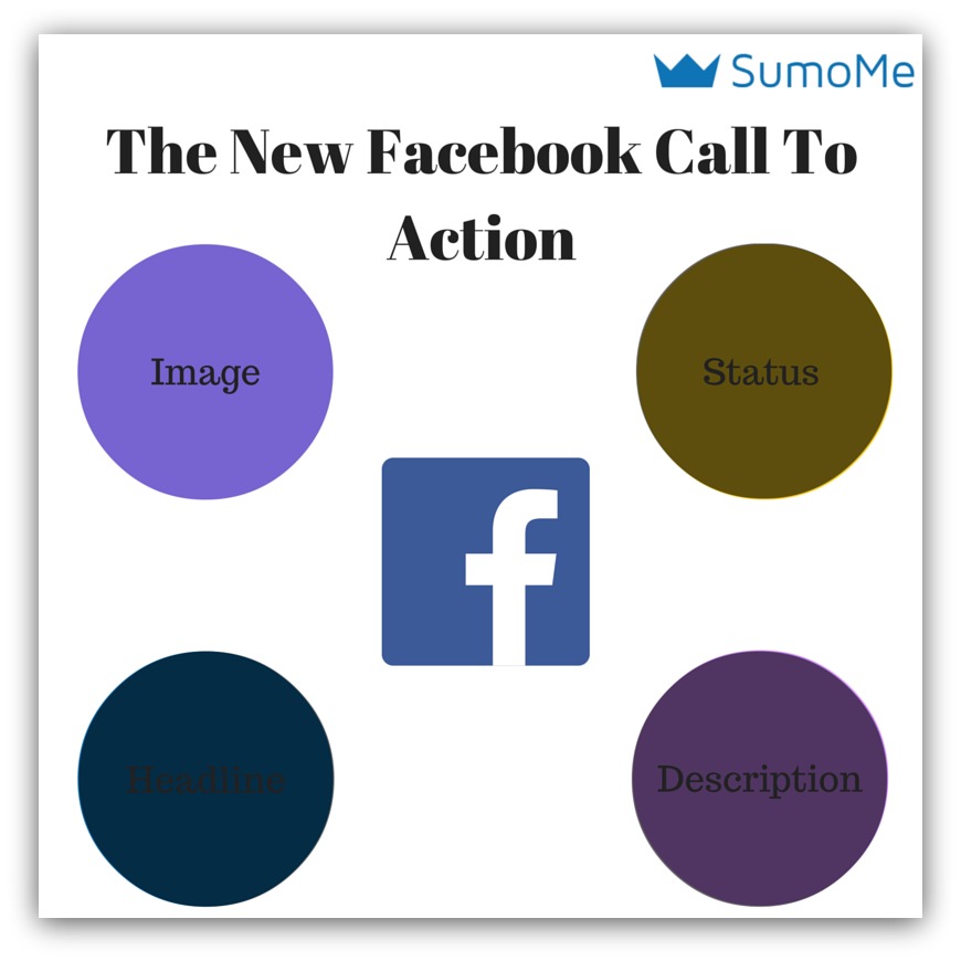
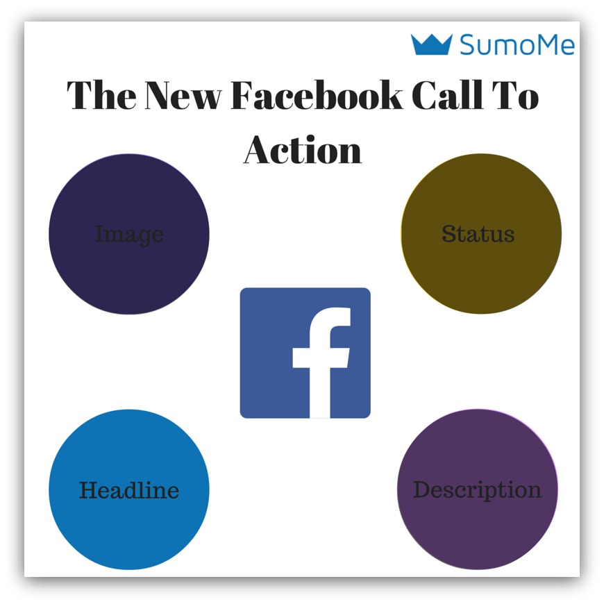
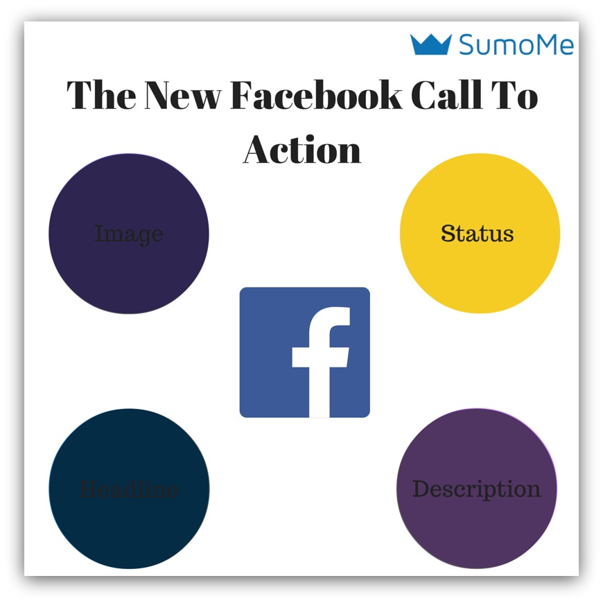
The New Way to Create a Facebook Call to Action
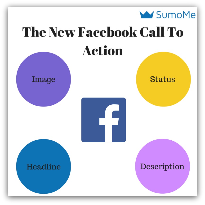
The new Facebook call to action is made up of four elements:
-
Your Image: You know what the image is. Your image will make people stop and read your message.
-
Your Headline: This is the headline under your image. It’s usually the title of the page you’re linking to.
-
Your Description: This is what’s under the headline. It acts as a modifier for the headline.
-
Your Status: That’s the text above the image. It’s what you usually use to convey your feelings on cats and elections.
These all work in harmony to make your audience do something.
Why do I list them out like this? Because Andrew Scherr, paid media manager of Bluestem Brands and formerly Leadpages, found that this is the order in which someone will see your post.
Those were his findings after carefully studying the engagement on his posts that have reached over 2.2 BILLION people. The majority of Facebookers will look at your image, then your headline, then your description and maybe your status.
So if that’s the progression, then it’s time to write some Facebook “calls to action” that actually get clicked and shared.
Let me show you how.
Or, if you want to save time, download this handy cheat sheet I created. It covers all four pillars and the best tip for each one.
Facebook Call to Action Pillar 1: Your Image
CALL TO ACTION: STOP SCROLLING
93% of the most engaging posts on Facebook have an image.
Let that sink in. If you haven’t noticed, Facebook has radically shifted to a visual platform. I mean, just look at my newsfeed (but not too closely):
For those counting at home, that’s two non-visual statuses and 16 visual statuses (video, image, etc.).
Seems everyone else got the memo about engaging posts needing multimedia. Mostly because I didn’t even notice the non-image posts.
So ask yourself this. If the average person has that many images on their newsfeed, what’s going to make them stop and read your post?
You better have a stand-out image. You can go three routes to make sure your post image is the bomb-diggity.
1) Make Your Images Unorthodox
Wanna know how I know I got someone’s attention 100% of the time?
It’s when I get this reaction: “Wait…what?”
It means they really thought about what I said, and it’s not jiving in their head. Our brains build up biases (not always the bad kind) to associate and process things quickly.
That’s how we’re able to move throughout our day-to-day lives so easily. It stops us from staring at a cow for 10 seconds, think about it and then go, “Oh, that’s a cow.” Those biases help us discern the normal from abnormal.
So when I see something like this on my news feed:
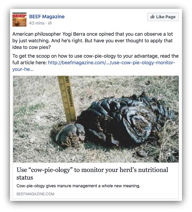
I quickly realize that it’s abnormal. Why is there a huge picture of dung in my news feed? It definitely makes me stop and go, “Wait…what?”
This one made a few of my friends stop and read:
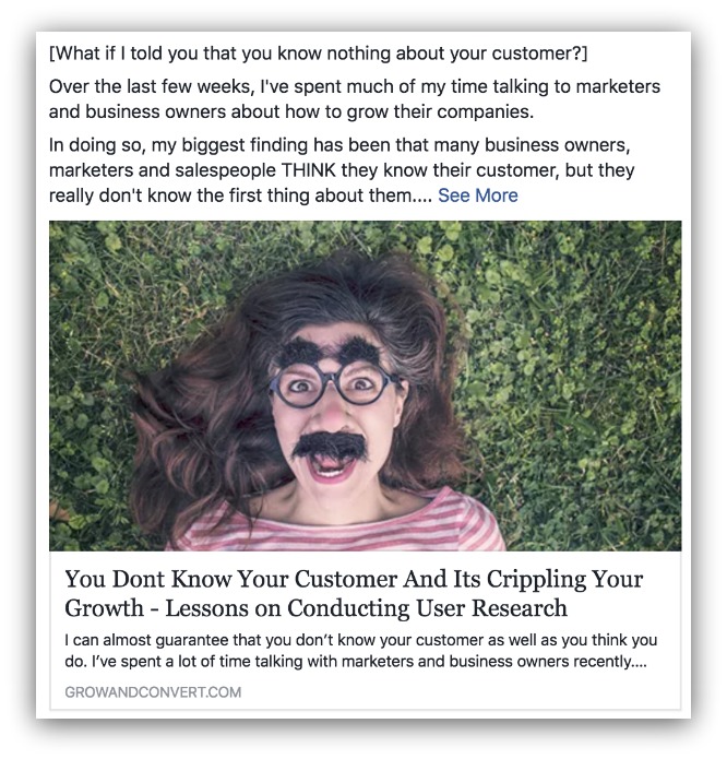
Why is that lady wearing a fake mustache and big Martin Scorsese eyebrows? It’s different, which is useful for spurts of attention grabbing.
But you can’t use it all the time. Your audience will catch on if you’re always posting unorthodox pictures. That’s why you can use these next two tips time and time again.
2) Make the Image Bright
Let’s take a page from the Pinterest playbook. Since Pinterest is almost 100% visual, we can learn something from their users.
Specifically, lighter images are repinned 20x more than darker images.
So there’s something to be said about lighter images. We already know retail clothing stores use lighter colors to evoke a calm, soothing experience for shoppers to put them in a better frame of mind.
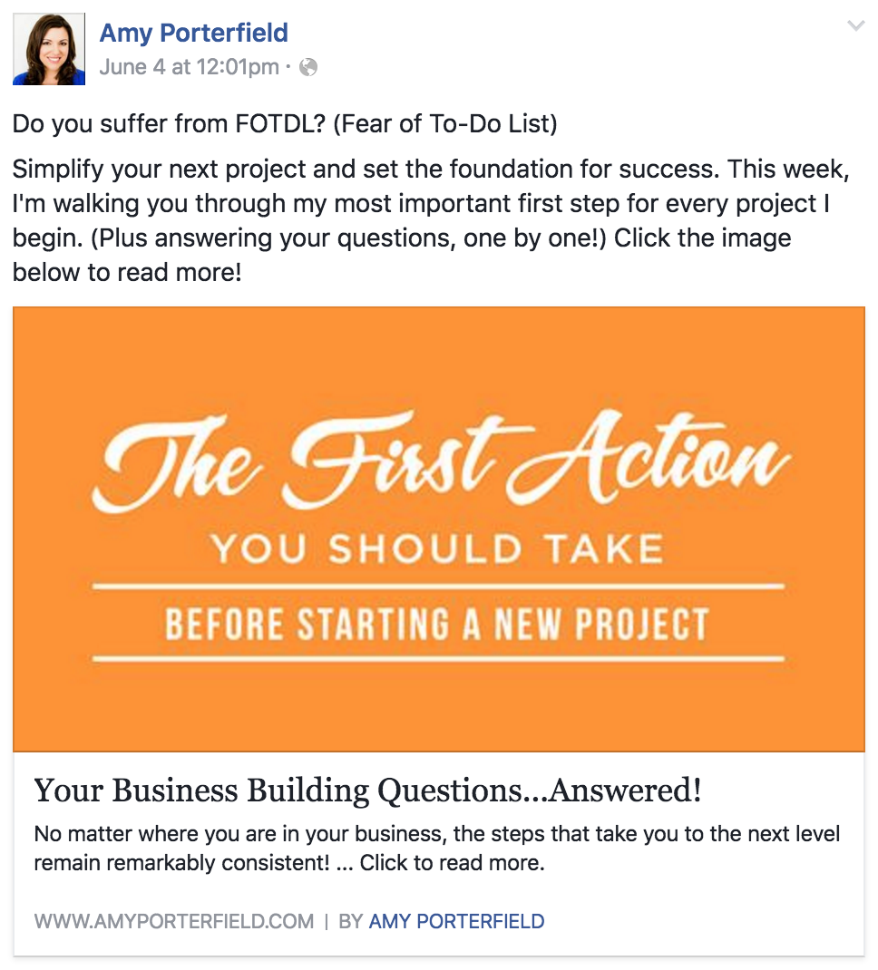
So it makes sense that lighter colors have better reactions as a whole. It’s why Amy Porterfield (aka the Facebook Queen) uses light colors in the majority of her posts:
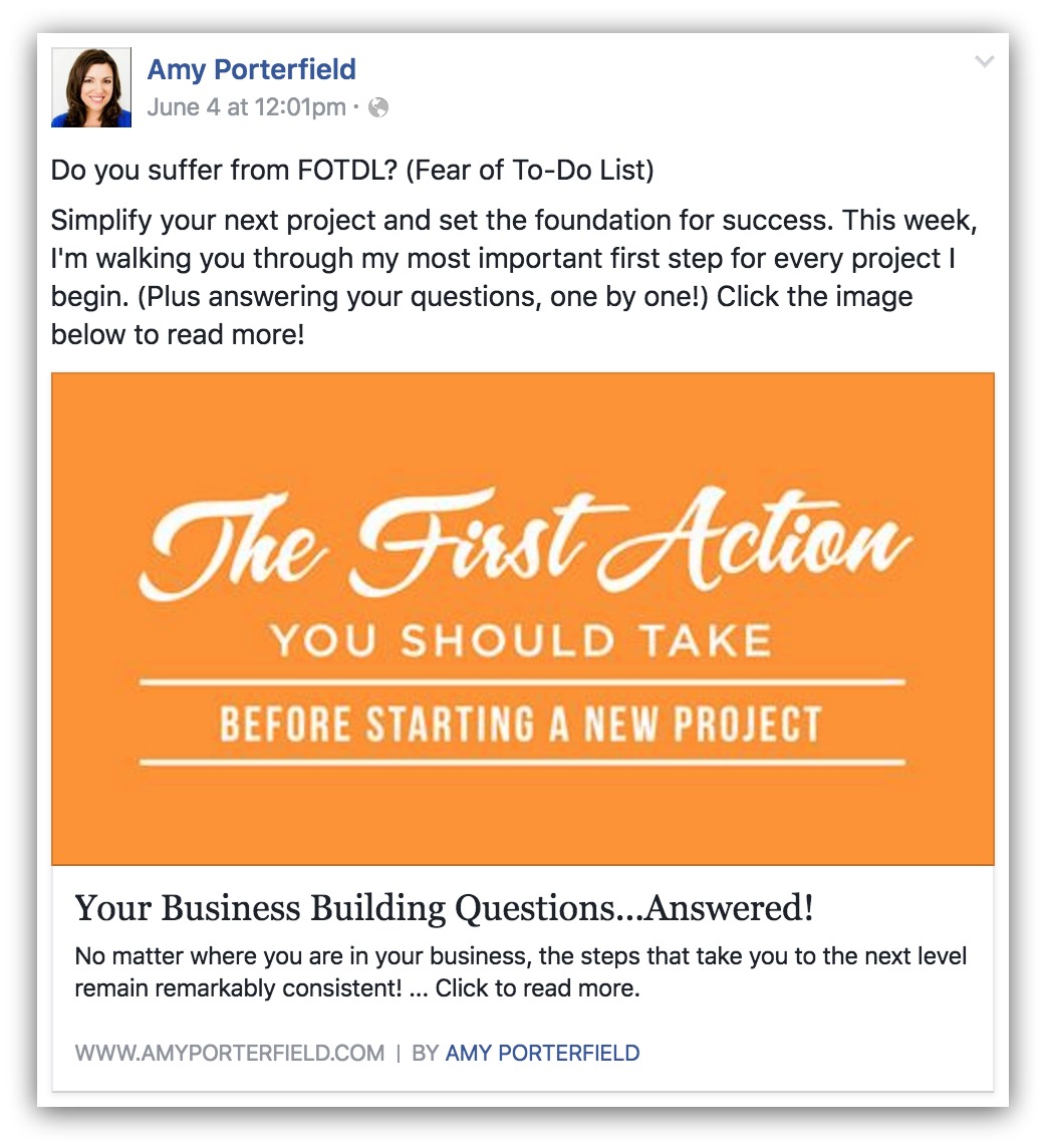
Many of her posts use plain, bright backgrounds to stand out. No fancy design or stock images or anything. Just a bright, simple background. And if one of the best Facebook experts alive is doing it…
Retailers have followed suit, too:
That’s a plain white background that makes the clothes pop off the screen. Make sure to brighten up your image before you release it to the Facebook masses.
3) Let Your Words Carry the Image
One of the more timeless TV advertisement rules is this:
- “The consumer should be able to get the meaning of the commercial while their TV is muted.”
I still don’t get the Old Spice commercials. But this is a good point for anyone creating an image for Facebook: let the picture convey your meaning.

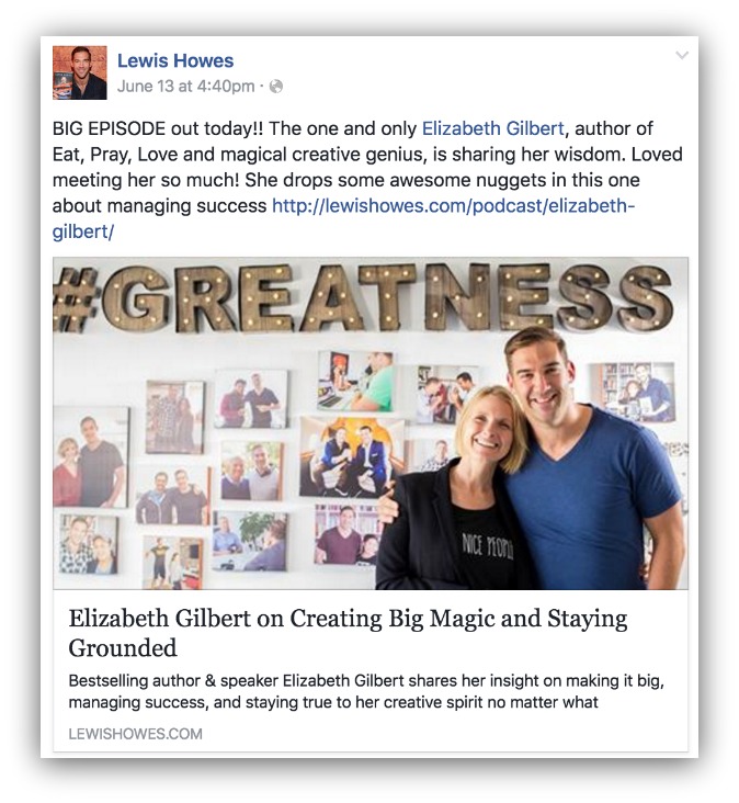
Go back to this Amy Porterfield example. Her image conveys the essence of her post. When you scroll through your feed, you already know what the post will be about simply because of the image.
That frees her headline and description up to build upon the message in the image. Or, if you’re looking for a more direct, attention-grabbing description…

This is a pretty clear message. You know exactly what the post is about (construction accident). Or, there’s the more subtle approach that leaves you curious:
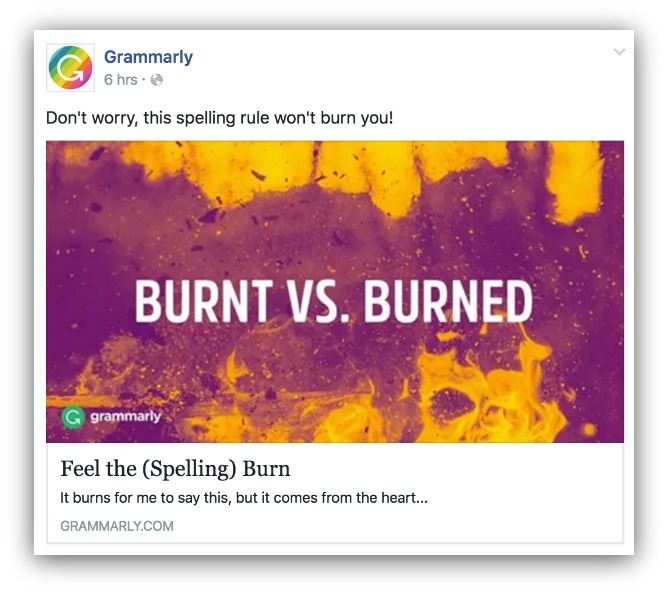
You might look at that and go, “Oh dang, what IS the difference between burnt and burned?” It’s intriguing enough to make you stop and at least read the post (which, in all honesty, could be written more enticingly).
Things to Avoid:
- Don’t pick a dark, boring image.
- Don’t use images with watermarks that aren’t your own (that’s just stealing)
- Don’t use a grainy or blurry image
- Don’t use an image that doesn’t relate to your post
If you need a quick, easy way to create your Facebook image, try Canva. It’s free and I use them exclusively on this blog to create every image. Plus they’ve got pre-made image dimensions for Facebook.
Building Up To The Perfect Facebook CTA: Image Only
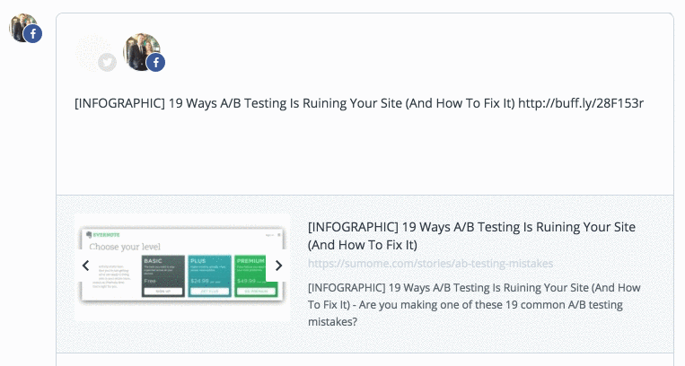
In each of these sections I want to show you what happens when you nail one pillar but forget the rest. So here’s a Facebook post that has a solid image but lacks in a headline, description and status:

Here’s a post with a crisp, bright image of shoes. If you’re looking for shoes, it’s enough to make you stop scrolling (which is the action we’re looking for).
But woof…the headline, description and status are all lacking. The headline doesn’t even talk about the shoes, and there is no description. The status is just a bunch of brands listed out.
So you may have made a Facebooker stop scrolling. But you’ve given them no reason to click through.
That’s why we move on to the second most important pillar: your headline.
Facebook Call to Action Pillar 2: Your Headline
CALL TO ACTION: READ THE POST
Which headline appeals to you more?
Let’s not talk about my photoshop skills.
OR
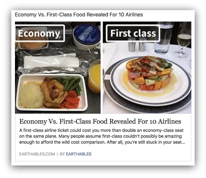
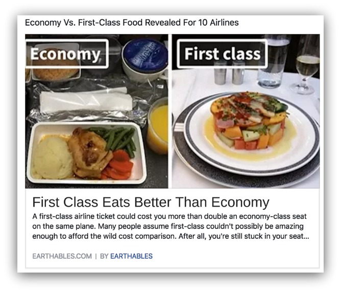
C’mon. We already know first class passengers get far better food than us mere mortals in coach. This isn’t shocking news, seeing as this observation is the staple of anyone doing a Jerry Seinfeld impression.
But that second headline?

That puts a whole new spin on airline food. Of course I want to see the differences between the choices. Especially if I get to see the differences across 10 different airlines.
It’s all in the presentation. It’s the exact same story behind those choices, but the headline presents it differently.
The words you choose to present your content are crucial. You may have a great image that made people stop scrolling, but if your headline doesn’t interest them then they’re gone.
TIP: Your headline can be one line long (56-58 characters) or two lines long (112-116 characters). If you use two lines, you have less room for the description.
Check out the headlines behind these high engagement posts:
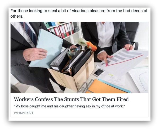
This is the “Tell All” approach. The formula is (Noun) + (Shocking Action) + (Shocking Outcome). It leads to a headline like this “(Workers) (Confess The Stunts) (That Got Them Fired).”
That’s a better headline than “Workers Say Why They Got Fired.” There’s much less emotion in that headline, yet it’s basically saying the same thing. When you add words like “confess” and “stunts” then it makes the headline more provocative.
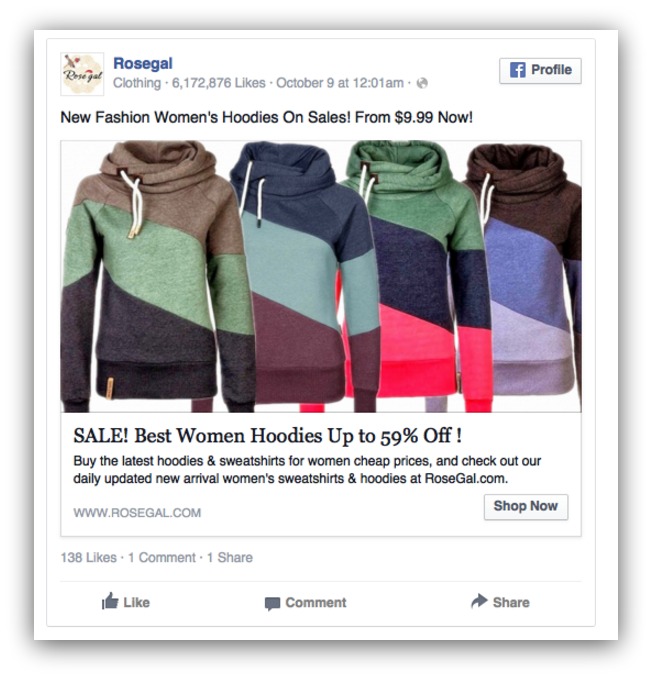
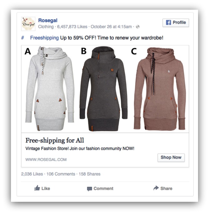
Here’s a benefits-driven approach. The formula is much more straightforward with (Benefit) + (Object). This headline flips it (it’d be better if it was “SALE: 59% Off Our Best Women’s Hoodies”), but it’s still effective.
This works best for those of you with discounts for products — 2-for-1’s, price reductions, coupons, etc.

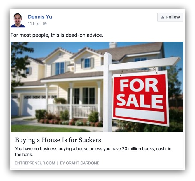
Oooo. How’s that headline feel, house owners? Does it anger you? Does it make you want to click and see what this person is all about?
What about you, renters? Does it give you a sense of validation? Does it make you want to see why you shouldn’t buy a house?
That’s the beauty of this kind of headline. It goes against the grain and makes a statement. The formula for this kind of headline is (Action) + (Contradiction).
If you’ve created content that can cause this kind of divide (without harming anyone), then this is a strong formula to lean on.
But if you’re looking for more headlines, you can try these two options:
1) These 49 Headline Formulas
We took these straight from our guide on how to skyrocket conversions with great headlines. These are proven formulas (like the ones you read above) that can help guide you in your headline-writing journey.
| Type | Formula | Example |
|---|---|---|
| The How to Headline | How to [Achieve a Desired Outcome] | How to Run Faster |
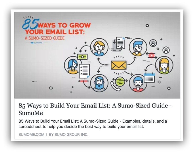
| The Ultimate List Headline | [Large Number] of Ways to [Achieve an Outcome] | 28 Ideas for Content Upgrades To Grow Your Email List |
| The Ultimate Guide Headline | The Ultimate Guide to [Achieve a Desired Outcome] | The Ultimate Guide to Eating Healthy on a Budget |
| The Fearmonger Headline | Warning! Are You [Something Undesirable]? | Warning! Are You Eating This Food That Could Kill You? |
| The Rally Cry Headline | [A Call to Arms] | Let’s Stop Eating This Poisonous Food! |
| The Proven Methods Headline | [Number] Proven [Actions/Ways] to [Achieve Desired Result] | 18 Proven Techniques to Build More Muscle in Less Time |
| The Mistakes Headline | [Number] Mistakes Most People Make When/With [Common Action] | 11 Mistakes Most People Make When Washing Their Hair |
| The Secrets Headline | [Number] Secrets to [Achieve Desired Outcome] | 7 Secrets to Becoming a Digital Nomad |
| The Outrageous Headline | [Outrageous/Controversial Claim] | Why Canadians Are Actually Evil |
| The Lessons Learned Headline | [Number] Lessons I Learned When/From [Experience] | 7 Lessons from General Assembly |
| The Social Proof Headline | [Social Proof] [Desired Outcome | The Tool Over 283,000 Websites Use to Grow Their Traffic |
| The Testimonial Headline | [A Quote From/Summary of a Testimonial] | How Sumo Changed My Business |
| The Objection Preemptive Headline | No/Yes, You [Pre-Empt Objection] to [Achieve Desired Result] | No, You Don’t Have to Count Calories to Lose Weight |
| The Question Headline | [Provocative Question] | Are You Still Eating Dairy? |
| The See What Happened Headline | [Person] Did [Unusual Action] [Timeframe]. Here’s What Happened | I Did Yoga Every Day for 6 Months. Here’s What Happened |
| The How/Result Headline | How [A Seemingly Inconsequential Action] Can [Undesirable Result | How Your Morning Coffee Can Lead to Heart Disease |
| The Celebrity Headline | How to [Achieve Desired Outcome] Like [Celebrity] | How to Sing Like Adele |
| The How to Without Headline | How to [Desired Outcome] Without [Unpleasant Action] | How to Increase The Traffic to Your Website (Without a Marketing Budget |
| The Silver Platter Headline | [Number or How to] Simple/Easy Ways to [ Desired Outcome] | 14 Easy Ways to Save $100 This Month |
| The Analysis Headline | We Analyzed [Number] [Measurable] And This Is What We Learned | We Analyzed 100 Million Articles (And This is What We Learned) |
| The Tutorial Headline | A [Power Word] Tutorial to [Achieve Desired Outcome | A Comprehensive Tutorial to Make a Budget |
| The Hacks Headline | [Number] Hacks to [Achieve Desired Outcome] | 25 Hacks to Save More Money |
| The Explainer Headline | Why [Thing] [Outcome] | Why Spirulina Makes You Smarter |
| The Steps to Result Headline | [Number] Steps to [Achieve Desired Outcome] | Inside The Porn Industry's Reckoning Over Sexual Assault |
| The WTF Headline | [An Odd or Funny Claim] | John Cena And His Giant Hands Playing With A Tiny Tortoise |
| The Quiz Headline | Quiz: [Which/What/How] [Quiz Topic]? | Quiz: Which Harry Potter Character Are You? |
| The Hot Button Headline | [Controversial Claim or Story] | People Called This Mom An "Exhibitionist" After She Took A Breastfeeding Pic With Santa |
| The Fortune Teller Headline | [A Claim as if You Know the Future] | You Won’t Be Able to Lose Weight in 2016. |
| The News Headline | Breaking: [Story | Breaking: Whooping Cough Outbreak in Your City |
| The Command Headline | [Strong Command | Stop Selling Out |
| The Reasons Headline | [Number/”Here’s Why] [Outcome] | 16 Reasons You’re Fighting With Your Spouse |
| The Imagination Headline | Imagine [Desired Outcome] | Imagine Becoming a Millionaire |
| The Little Known Methods Headline | [Number] Little-Known Ways to [Desired Outcome] | 15 Little-Known Ways to Actually Reach Your Goals This Year |
| The Ignorance Avoidance Headline | What You Should Know About [Topic] | What You Should Know About Your Roth IRA |
| The Snackable Headline | [4 Words or Fewer Summarizing Topic] | You Aren't That Special |
| The Pattern Interruption Headline | [Claim That Goes Against What Most People Think is True | How Fruit Will Make You Fat |
| The Solutions Headline | Why [Problem] (And What to Do About It) | Why You’re Not Getting Traffic to Your Website (And What to Do About It) |
| The Expert Roundup Headline | [Number] [Expert] Share [What] | 14 Nutritionists Share Their Favourite Plant-Based Recipes |
| The Reminder Headline | Reminder: [Claim or Truth] | Reminder: Your Weight is Not a Reflection of Your Health |
| The Comparison Headline | Are You More Like [X] or [X]? | Are You More Like a Tiger or a Lion? |
| The Trivia Headline | Can You [Find/Spot/Answer/etc] | Can You Find The Problem With This Photo? |
| The Keyword Headline | [Keyword]: [Supporting Keywords] | Healthy Eating 101: How To Eat Healthy on a Budget |
| The Promise Headline | [Promise of What Your Business/Content Will Do] | We Can Help You Boost Your Traffic By 20% |
| The Results Headline | How We [Desired Result] in [Timeframe] | How We Boosted Our Traffic by 20% in 6 Weeks |
| The Teaser Headline | These/Find Out Which [Thing] Could/Will [Desired Outcome] | These 6 Foods Could Help You Lose 15 Pounds |
| The Sidenote Headline | [Headline] ([Sidenote to Tease One of the Points] | 7 Lessons We Learned from General Assembly (#2 is Our Favorite) |
| The Branded Headline | [Headline Formula] [Unique Branding] | 123 Ways to Get More Website Traffic: A Sumo-Sized Guide |
| The Urgency Headline | [Action] NOW! | Fix Your Conversion Rate NOW |
| The Audience Headline | [Audience]! Are You [Undesirable/Desirable Outcome]? | Bloggers! Are You Leaving Traffic on the Table? |
2) The Automatic Kickass Headline Generator
Just like the title says, we created a free tool that helps you generate a bunch of headlines automatically!
Yep, just plug in some words like a mad lib and our generator will spit out some kickass headlines.
Try Out The Kickass Headline Generator >>>
Things to Avoid:
- Don’t write too long of a headline.
- Don’t make grammar mistakes.
- Don’t be boring.
How Do You Know What Your Post Will Look Like?
This is the million dollar question. When you share a link on Facebook, you have no idea how it can turn out.
If your site’s code isn’t optimized for sharing, you could be pulling the wrong images, headlines and even descriptions (sometimes all at once).
There’s two ways to prevent that from happening.
1) Facebook Sharing Debugger Tool
This tool created by the Facebook developer team helps you see how your link will show up in a Facebook post.
All you do is head over to the tool and insert the URL you’re sharing on Facebook:
%(20)
Then Facebook will give you a preview and offer suggestions if something is wrong:
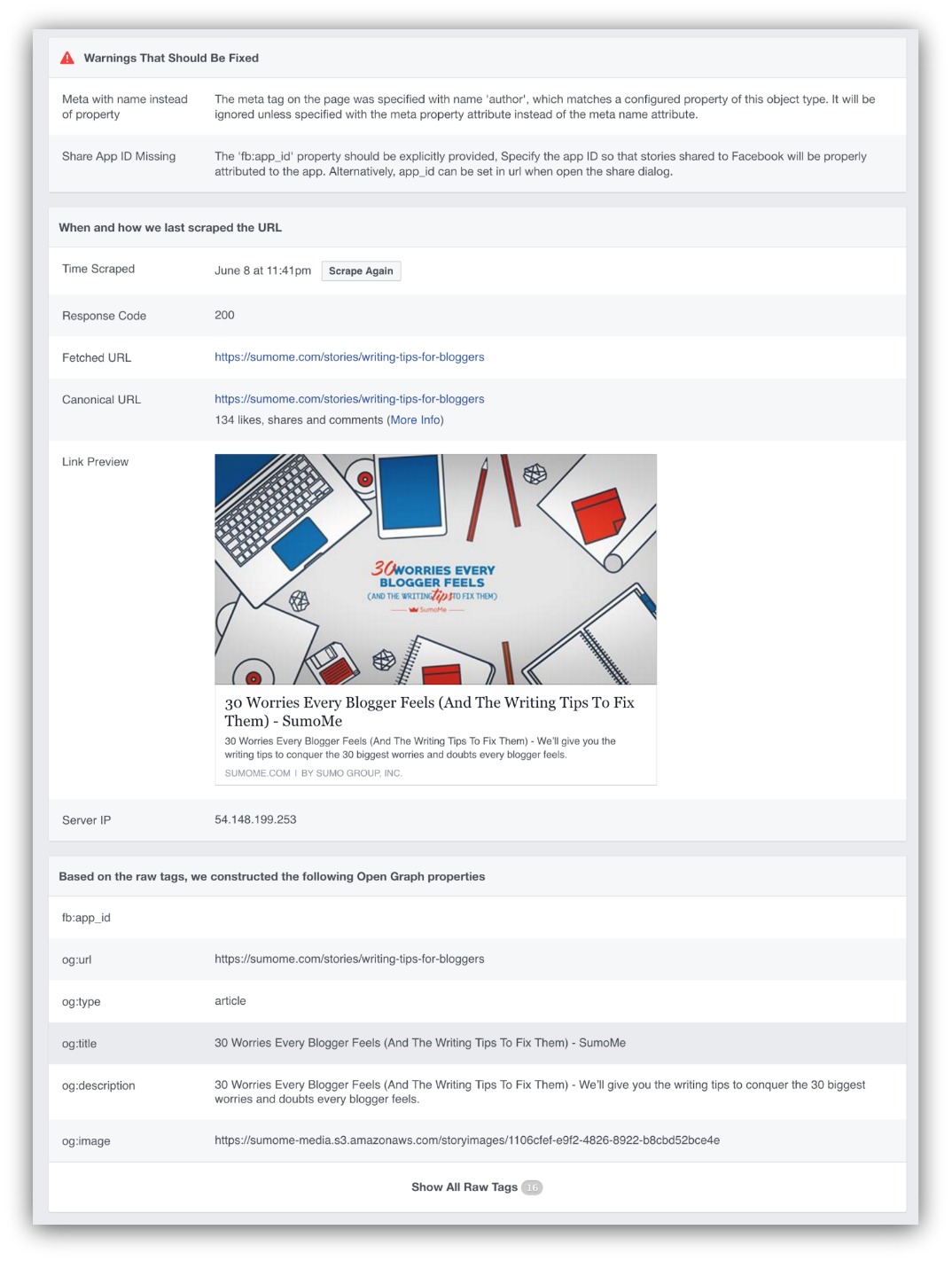
For Sumo, we’re missing an author tag. That’s why our stories show up as “By: Sumo Group Inc.” That’s one thing we could fix to attribute the guide to the author.
If you look in the link preview section, you’ll see how the link would look if posted. Below that, Facebook explains where it’s pulling that information from based on your tags.
So that’s a fine and dandy way to see how your link would look.
But if something’s wrong, what are you going to do about it?
If you don’t know code, then fixing any problems like pulling the wrong image or deleting your description would seem impossible.
That’s why we have option two.
2) Use Buffer
Buffer is a social media scheduling tool. Most people use it to pre-schedule their tweets, Facebook posts and other social media
But you and I can use it to completely change how our links show up on Facebook (without touching any code).
You’ll see a post preview when you paste your link into the status section. You can follow my mouse, but I can change the image used (or upload my own) and even edit the headline and description.
It’s the most simplistic way to make sure your posts look exactly the way you want them to every time.
Building Up To The Perfect Facebook CTA: Image and Headline Only
Granted, the image and headline are the two most important pillars of the new Facebook call to action. They alone can make someone stop, read and click.
But that’s not always the case:

This is a promising post. The image is bright and has some funny words, and the headline is straightforward with an interesting twist.
But there’s no description. And, truth be told, it could use one. It’s pretty tough to read the words on the cup, so a description that perhaps had a funny lyric and told me what to do would be key.
That brings us to the third pillar: the description.
You can grab the entire cheat sheet by clicking here.
Facebook Call to Action Pillar 3: Your Description
CALL TO ACTION: CLICK THROUGH
Consider this conversation for a moment:
This is the extent of my artistic “ability.”
It’s one thing to get someone’s attention. Then another to get them interested. But the last step of clicking through? That’s the toughest part.
That’s where the description comes in. The image stops someone from scrolling. The headline reels in their interest. Then the description builds on that interest to get the reader to click.
Your description for your post will, by default, be one of two things:
-
Your Page Meta Description: This is how you describe the page. Most pages have a built-in area to write a meta-description. It’s basically the summary of your page.
-
The First Words of Your Page: If you don’t have a meta description available then Facebook will show the first words on your page and go until it runs out of space. (TIP: If you don’t have a meta description, check out these plugins and get the Yoast one.)
For example, when I post something from Sumo, it looks like this:
It pulls our title and page meta description into the post description. For 100% honesty, we could improve our descriptions by removing the title and giving more information to supplement the headline.
PRO TIP: When writing your description, you have two to three lines (164 to 246 characters, respectively) to work with. If your headline is two lines long, then you only have two lines for your description.
But remember, you can change that description in Buffer. So that means you can shift the focus from an SEO-rich meta description to a more enticing, Facebook-focused description.
Though the big question is, what’s it mean to have a good description?
It simply boils down to this: A good Facebook description builds upon your headline’s promise while leaving a reader wanting.
Here’s an example of that not happening:

It’s that airline post again (but seriously, what is the deal with airline food?). The image is great and the headline nails it.
But the description lacks a dedicated meta description, so Facebook is pulling the beginning of the article until it runs out of room.
So why doesn’t this work for a description? Technically it builds on the headline, and it leaves readers wanting by cutting off the description.
Here’s the thing. It doesn’t build on the headline the right way and it leaves the readers wanting for the wrong reasons.
When I talk about building on a headline, I’m referring to adding value through summary. If I read your headline and description, I should know exactly what your content will cover. And it shouldn’t take three full lines to do it.
AdEspresso analyzed thousands of Facebook posts and found that most descriptions were less than 28 words (or two full lines):
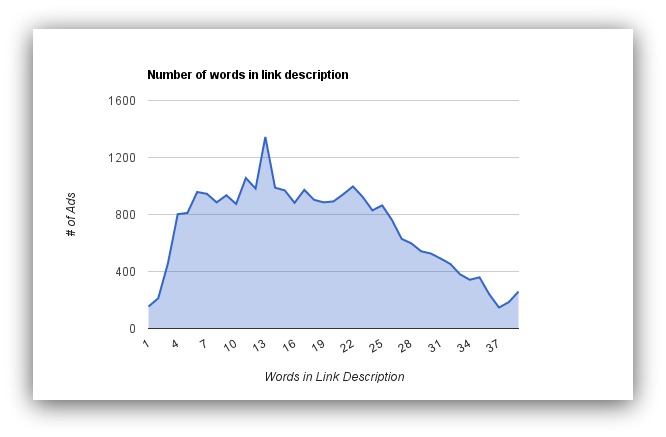
That means you should stick to under two lines of text for your description. And those two lines should make me want to click through.
Let’s use examples we’ve already seen in this guide to show what good descriptions look like. Reinforces learning and all that jazz:
Look how this description builds on the headline. The headline itself is a provocative statement, and the description follows up with an answer that’s still provocative.
That’s what building on a headline means. The tone of the headline was provocative, so the headline follows that tone.

Backing away from the provocative path, take a look at what Amy Porterfield did with her description. The headline promises to answer business building questions.
The description builds on that, stating that there are consistent, repeatable steps that everyone can take to build their business.
I…I want to see what those steps ARE. The description does a fantastic job of building on the headline, promising to provide value for anyone wanting to build their business.
Alright, one more example for the folks that are linking to a product:
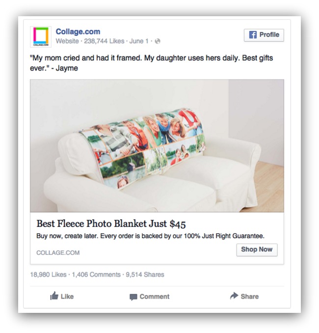
So we know you can get a fleece photo blanket for $45. The headline is clear.
Why I like is the peace of mind the description offers. Every order is backed by a 100% “Just Right” guarantee. Meaning if you hate a photo or the blanket isn’t warm then you just send it on back.
That gives a great incentive to buy. They’re presenting a product then silencing what could be a potential objection with the description.
The biggest thing to remember is to build on your headline and make the reader want more. If you do that then you’ll get those clickthroughs.
Things to Avoid:
- Don’t write too long of a description.
- Don’t disconnect from the headline.
- Don’t lose your momentum from the headline.
Building Up To The Perfect Facebook CTA: Image, Headline and Description
When you get three of the four pillars right, Facebookers are going to click on your post like crazy.
On the flip side, when one pillar is glaringly lacking compared to the three other pillars, it can be a bit of a buzzkill:
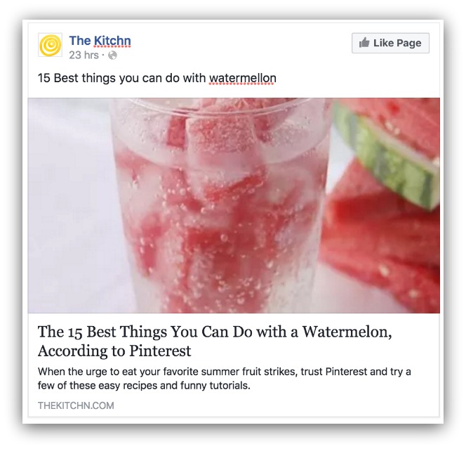
Full disclosure: I edited the headline. The Kitchn had a good one.
A bright, refreshing image. A headline that makes me salivate. A description that builds well off the headline.
And then the status. DAMNIT STATUS, WHY’D YOU LET ME DOWN?!
It’s just a rehashing of the headline, and it isn’t even formatted correctly. Plus “watermelon” is misspelled. And there’s no link or ask in that status. It makes the post look bad.
Which is why we need to talk about the last pillar of the new Facebook call to action: the status.
Facebook Call to Action Pillar 4: Your Status
CALL TO ACTION: CLICK THROUGH
I’ll admit it. The first three pillars on this list will be the biggest deciding factors in if your post is clicked on.
But here’s the thing. Although the normal progression is image → headline → description → status, it won’t always happen like that.
What might happen is someone goes image → status → headline → description. And when that happens, you need to make sure your status is every bit as engaging as your headline and description.
There are two schools of thought when it comes to writing a status.
Go Long
The long approach is used if you believe your post needs more context than the headline and description can provide.
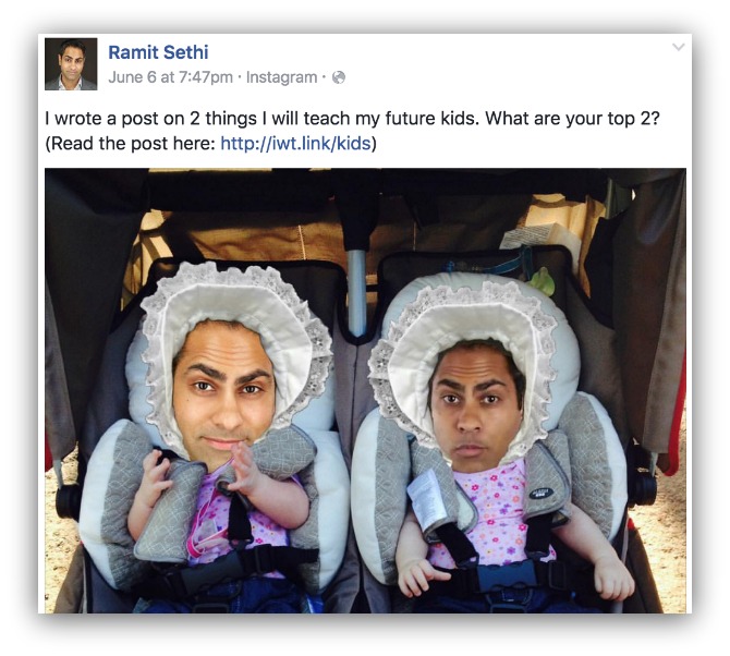
Ramit Sethi is known for writing long emails, and sometimes he brings that philosophy over to his Facebook posts:
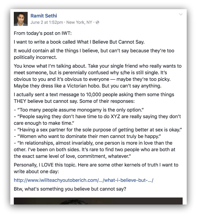
Ramit gives a sneak peek at his post, almost like a sample of what’s to come. He gives you a few controversial kernels since the topic is about a variety of things he wishes he could say.
This acts as a long sell on the content — almost like a short landing page. Writing a long status means you’re doubling down on your ability to be more persuasive than your headline or description.
Go Short
The other option is to write a shorter status. If you write short, you’re banking on your status provoking enough curiosity to either A) Read your headline and description or B) Click through to your content.
Buzzfeed uses their status as a sort of commentary on their content:
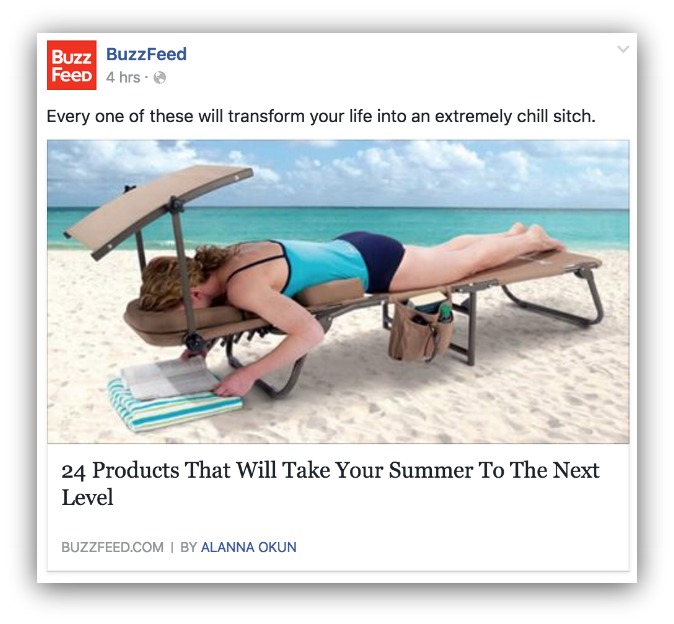
Ok, get past the obvious 22-year-old lingo and look at the theory behind the status. The rationale is you’ll read the status and go, “Every one of WHAT will transform my life?”
That forces you to read the headline. Buzzfeed knows their headlines get massive clicks. So anything to bring your eyes down to the headline almost guarantees a click through.
Though sometimes shorter status can be more straightforward:
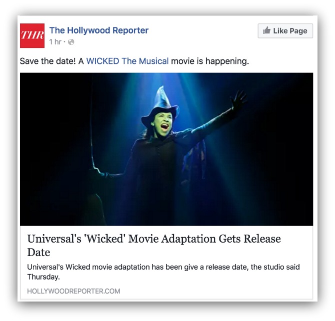
This status from The Hollywood Reporter is a straightforward announcement. They link to the Wicked page in the status, but for the most part it’s a short and sweet announcement.
They bank on two things:
-
Your Excitement: People love Wicked (I guess), so that kind of announcement will leave the reader wanting more.
-
You Knowing Something Is Attached: If you see a post, you can also see there’s a big image attached to it. It’s the combo of seeing something interesting and knowing there’s more information below (if you click through) that works so well.
I know. You’re reading these approaches and wondering, “Which type of status do I write?”
Let’s turn to science.
What Does Science Say About Your Facebook Statuses?
Science says the most engaging statuses are under 40 characters. But statuses with 80 or less characters receive on average 66% more engagement than anything above 80 characters:
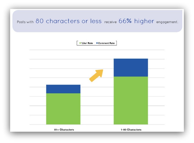
In that regard, you should aim for shorter statuses.
What Do I Say?
I’ve got a slightly different take on the matter.
Yes, I think short statuses are better than longer ones (why ask someone to read a lot just to click through and read more). Though it all depends on what your particular audience responds to best.
But there’s something the majority of articles miss when talking about Facebook statuses that work.
They need to include a freaking ask.
It’s the craziest thing to not include an ask in your status. That can range from including your link in the status to asking people to click on your image below.
The most successful people on Facebook follow that methodology:
Every one of these statuses either includes a link to the content or asks to click the link below. It’s that direct type of ask that makes it much easier for a reader to act on your message.
Don’t forget to include an ask in your Facebook status.
Get The Perfect Facebook CTA Cheat Sheet
I just gave you the four pillars of the perfect Facebook call to action so you can start cashing in on all that traffic.
But it’s a lot to remember, isn’t it?
To make it easier to create the perfect Facebook CTA, I’ve created a cheat sheet that provides the best high-level tips so you never forget the tips in this guide.
If you’re sharing anything on Facebook, make sure you download this cheat sheet so you create a perfect CTA every single time.


Add A Comment
VIEW THE COMMENTS